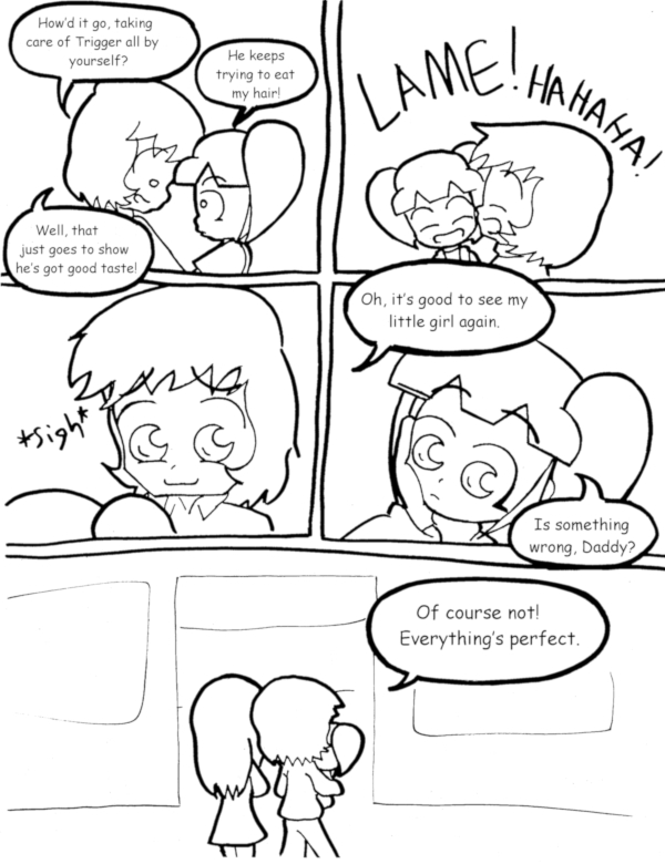
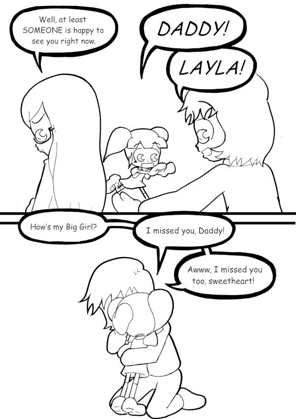
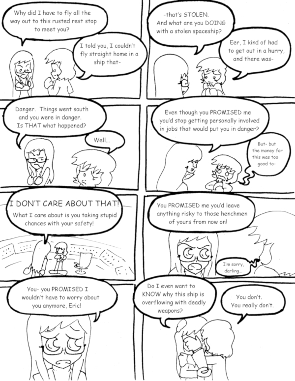
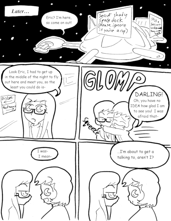
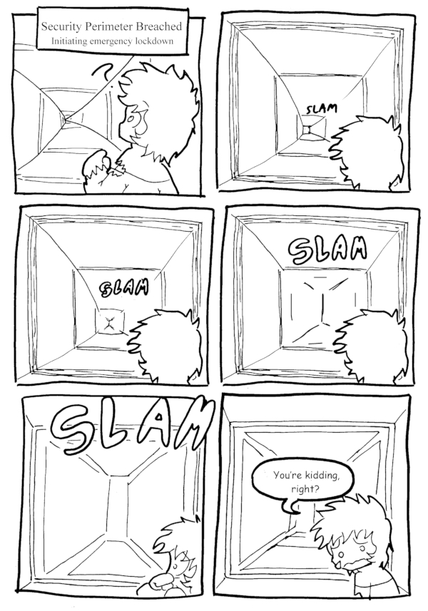
(Historical Notes: It’s done! IT’S DONE! ALL OF THE KILLER STATION OF DEADLY DOOM IS FINALLY BACK ON LINE! Holy crap, I swear it took me longer to get the re-posts done than it did to actually draw these things[…]↓ Read the rest of this entry…
Posts Tagged TWC
(Historical Notes: AAAAAAAAAAND THERE IT IS. We’ve been watching Layla’s Dad this whole time! I forget how many people actually called this ahead of time. I know at least SOMEBODY claimed to have seen the reveal coming as soon as[…]↓ Read the rest of this entry…
(Historical Notes: Really, this is was the first time I actively started retconing anything I’d previously established in the comic, since I lucked out the whole “Layla and Trigger are the same age” idea was never explicitly stated in the[…]↓ Read the rest of this entry…
(Historical Notes: Okay, between constant changes and retcons in both design and personality, it’s entirely possible that even current readers might not grasp what’s going on right there, let alone readers back in the day. So I’ll hold off on[…]↓ Read the rest of this entry…
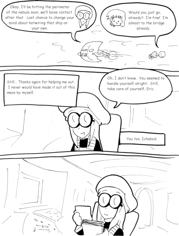
(Historical Notes: And you might THINK this marks the end of the story, and for Ichabod it most certainly does, but there IS a denouement that’s kinda sorta really important…)
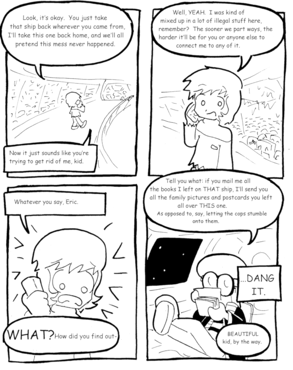
(Historical Notes: …though nobody ever said he was a GOOD thief. Also, Future Ichabod really REALLY hopes nobody misconstrues that last line, for reasons that new readers will soon find out.)
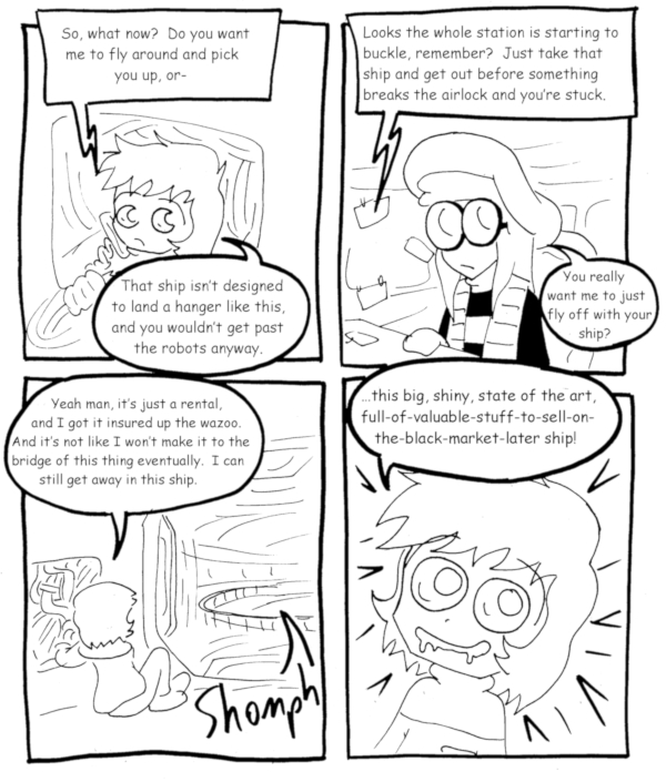
(Historical Notes: Notice that neither of them even pay lip service to the notion of picking Mooney up. Also, gotta balance those recent showings of courage with a reminder that Eric IS still a thief at heart.)
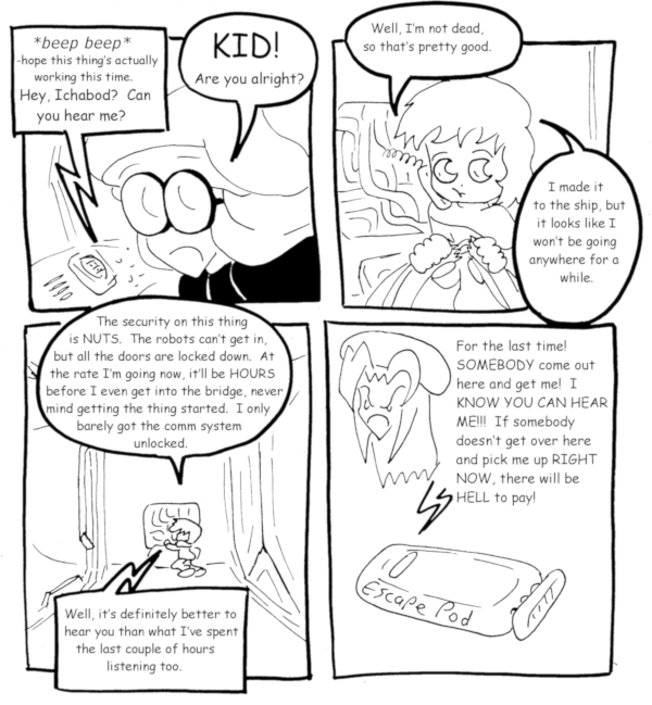
(Historical Notes: And thus, we come upon a truly historic milestone, the LAST time I get to complain about how Mooney disappears for so much of the final act of this story! Heck, even this token final appearance is kinda[…]↓ Read the rest of this entry…
(Historical Notes: Okay, this is another one of those cases where the sloppy art isn’t just annoying from an aesthetic standpoint, but actively interferes with the joke. The time-saving technique of just copy/pasting the same hallway and crudely adding some[…]↓ Read the rest of this entry…
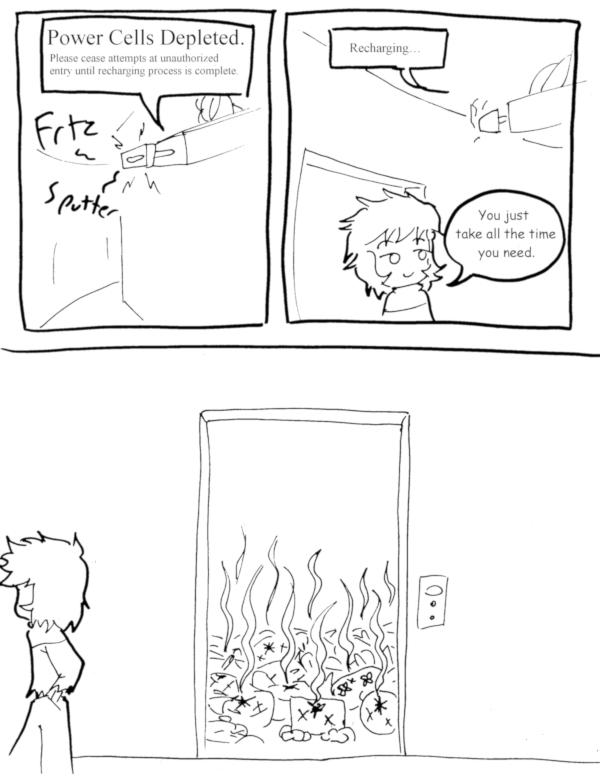
(Historical Notes: It was very considerate of all the robots to stay lined up right in front of the door instead of spreading out beyond the gun’s range.)
