2010 Incentives – page 18
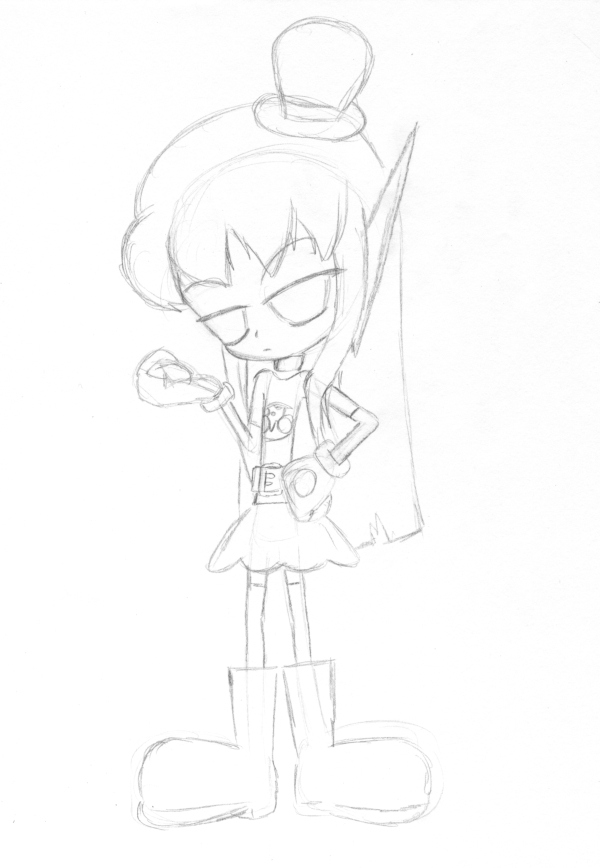
(Historical Notes: Have you figured out the fundamental problem with these Bridget & Alphonse redesigns yet? Even if you aren’t conscious of it, you already know what it is. It’s gnawing at your gut, that feeling that something’s just WRONG here. It’s the eyes. In my scramble to give their faces more detail, I got rid of the round, thick-bordered circles and gave them what’s basically standard Anime Eyes that are just whited out. It’s not quite as obvious on Bridget, since her glare means we don’t see as much of the eyes, but even here it’s just objectively incorrect. This is not what Bridget and Alphonse’s eyes look like. Fix what you did wrong, Past Me.)


Discussion ¬