2013 Voting Incentives – page 6
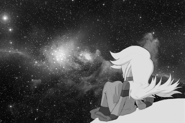
(Historical Notes: Oh man, I REALLY liked this one, right from the start. Arguably, Avatar looks a little… scrawny here, or at the very least the robe looks too thin. But the incorporation of the photo background, one of my first attempts to do this on a grand scale, turned out QUITE nicely. In fact, I toyed with the idea of making a color version of this available as a wallpaper image… but never did. I think the main reason was that the space image is one of those NASA stock photos and I felt a bit weird about doing too much with it, but the more practical reason really would have been actually getting the color balance and resolution right. It’d be REAL easy for icons to get hard to read amid all those stars, ya know?)


You still totally should do this as a background – NASA photoshops and fakecolors all those images anyway, so it’s not like you’re really messing with the original photo 😉
Her robe looks different because it’s in microgravity and also no atmosphere, so it’s bound to hang differently on her than what we normally see indoors. That’s the story I’m going with 🙂
agreed this would be awesome as a background