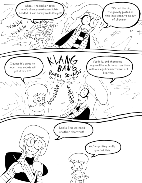
The Killer Station of Deadly Doom – page 109
(Historical Notes: Okay, THIS time my complaint is about the layout. The bottom panel, aside from being annoyingly off-center, is too big and wastes too much space. The TOP panel, on the other hand, is way too small and cramped. That panel should have been the whole top half of the page, so we could more clearly see Eric and Ichabod walking at a funky angle, then the other two panels should have been side by side on the bottom row. This concludes today’s installment of “Things I Probably Would Have Noticed If I’d Done More Than One Draft Of These Pages.”)


Discussion ¬