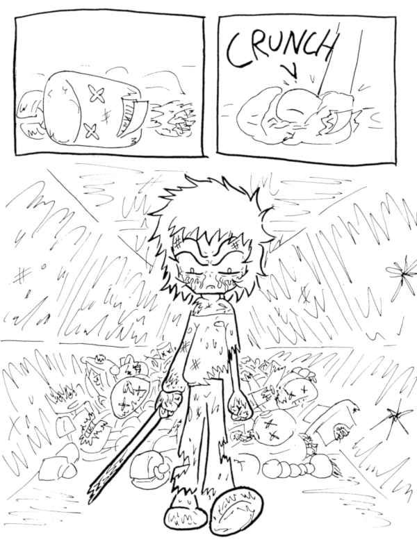
The Killer Station of Deadly Doom – page 141
(Historical Notes: Okay, this is a cool moment, but the art REALLY lets it down. Even my normal standards for the time, the proportions on Eric are especially wonky and distracting. I may complain about having to draw odd perspectives, but I actually think it’s these flat, looking directly straight-ahead images that give me the most trouble. This is another one where I was STRONGLY tempted to try and re-draw some bits… until I saw how long it took me to even just re-edit some existing art.)


Discussion ¬